Category: Branding and Artwork

  • Teaser poster – Tokyo Light Cycle

    Teaser poster – Tokyo Light Cycle

    [et_pb_section admin_label=”section”] [et_pb_row admin_label=”row”] [et_pb_column type=”4_4″][et_pb_text admin_label=”Text”]

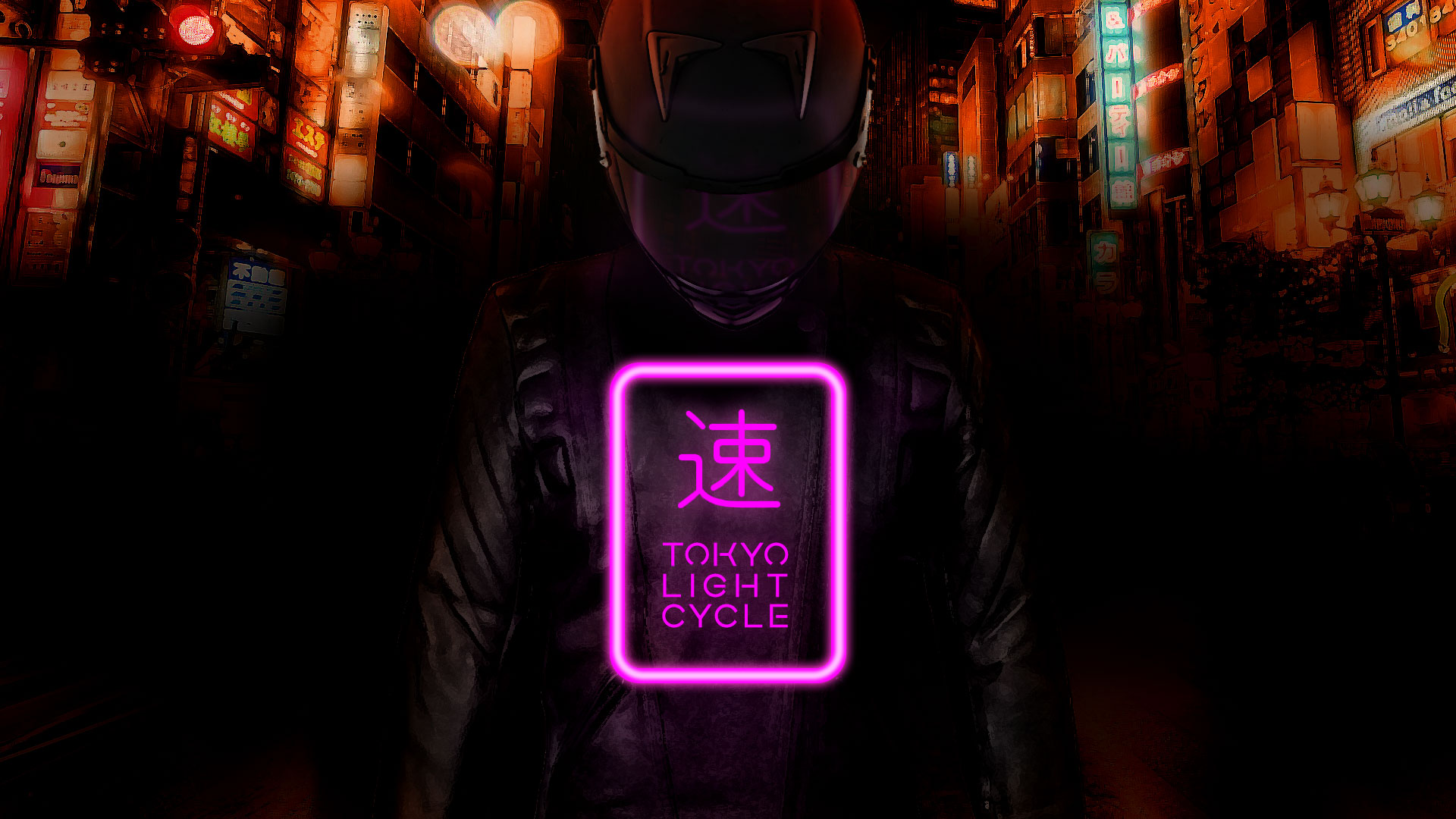
    Created for a project titled Tokyo Light Cycle, an upcoming independent video game.

    The aim was to evoke the feeling of the game itself: an oppressive, neon soaked thrill ride through a city in the dead of night.

    With the game itself still in development, it became about trying to create an intimate and claustrophic atmosphere.

    The main character is at the same the focus but also the element that stands out the least, framed as a spectre by the reflected light behind and in front of her.

    Background

    The background is taken from a real shot of Tokyo, made hazy and and unreal by chromatic abberation and over saturation.

    The city after all is kind of the antagonist here. The force the player must best. I liked that the city looms over the main character. Something oppessive they can’t escape.

    Logo

    I was quite pleased with the logo I came up with. I wanted to use a kanji symbol and chose one roughly meaning “speed”.

    I went through a variety of designs for the logo, both with and without the symbol, but the logo always ended up incomplete without it so instead focussed on trying different layouts before settling on the neon sign version.

    I’d like to revisit this poster to sharpen some of the details and bring the three elements (background, character, logo) closer together in terms of texture.

    But overall I’m pleased with how it turned out.

    [/et_pb_text][/et_pb_column] [/et_pb_row] [/et_pb_section]
  • April Fools at Mitsubishi Motors

    April Fools at Mitsubishi Motors

    Every year I like to provide a little April Fool’s Day material for our Social Media channels and Intrant. It’s a fun challenge to come up with designs that ride the line between plausible and ridiculous. It can’t be so daft that it’s immediately obvious its not real, but also wants to be just odd enough that it raises an eyebrow.

    The Eclipse Cross Hanzo

    Design for a special edition of the Mitsubishi Eclipse Cross

    The Eclipse Cross Hanzo was a nod to Tarantino’s Kill Bill in both the name and colour scheme, which also felt like a good fit for Mitsubishi Motors as a brand. Unfortunately the Hanzo was deemed too appealing and we didn’t use if for fear of a negative response from people who loved it only to discover it wasn’t real.

    Eclipse Cross Hanzo
    A bold imagining of a Special Edition Eclipse Cross with two doors, lowered suspension and a striking yellow and black paint job.

    The Shogun SWB Pickup

    This tongue in cheek combination proved incredibly popular, with more than one Mitsubishi dealer jumping on the phone to be the first to order this non-existance hybrid of the classic Shogun 4×4 and the bed of a modern pickup truck.

    The Pickup Truck (nicknamed the SP Phantom) took the short wheel base of a real Shogun, replacing the boot with the loadbed of an L200 and topping it off with some cool Sports bars on the back.

    The L200 Triple Cab

    Leaving the daftest until last, we have the L200 Triple Cab, a pickup truck crossed with a stretched limosine that would be a nightmare to park and make the truck completely unusable as the farmers/builders/adventurers dependable workhorse that it’s designed to be.

    The L200 Triple cab is simply an elogated L200 Double Cab. In retrospect we should have made it even more ridiculous, perhaps with a second set of rear wheels.