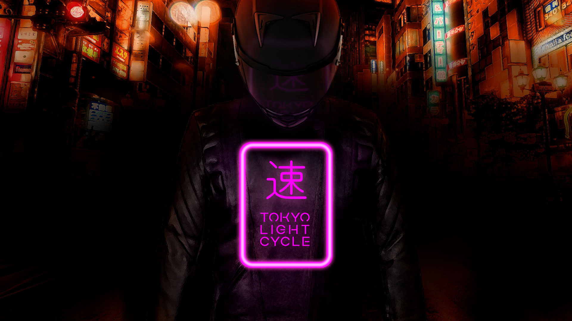
Created for a project titled Tokyo Light Cycle, an upcoming independent video game.
The aim was to evoke the feeling of the game itself: an oppressive, neon soaked thrill ride through a city in the dead of night.

With the game itself still in development, it became about trying to create an intimate and claustrophic atmosphere.
The main character is at the same the focus but also the element that stands out the least, framed as a spectre by the reflected light behind and in front of her.
Background

The background is taken from a real shot of Tokyo, made hazy and and unreal by chromatic abberation and over saturation.
The city after all is kind of the antagonist here. The force the player must best. I liked that the city looms over the main character. Something oppessive they can’t escape.
Logo
I was quite pleased with the logo I came up with. I wanted to use a kanji symbol and chose one roughly meaning “speed”.
I went through a variety of designs for the logo, both with and without the symbol, but the logo always ended up incomplete without it so instead focussed on trying different layouts before settling on the neon sign version.
I’d like to revisit this poster to sharpen some of the details and bring the three elements (background, character, logo) closer together in terms of texture.
But overall I’m pleased with how it turned out.
